Visual Demo
This notebook demonstrates how to use MissMecha’s visualization module to inspect missingness patterns in data.
We will:
Visualize missing data matrices
Explore nullity (missingness) correlation heatmaps
Apply visualizations to both tabular and time series datasets
Import Required Libraries
[1]:
import pandas as pd
import numpy as np
from missmecha.visual import plot_missing_matrix, plot_missing_heatmap
from missmecha.generator import MissMechaGenerator
Matrix Visualization (Simple Tabular Example)
We first create a small DataFrame and manually introduce missingness.
[2]:
np.random.seed(42)

data = {
    'age': [25, 30, 28, 40, 22, 35, 32, 26, 27, 38],
    'income': [50000, 60000, 58000, 61000, 52000, 59000, 57000, 56000, 62000, 54000],
    'gender': ['M', 'F', 'M', 'F', 'F', 'M', 'F', 'M', 'F', 'F']
}

df = pd.DataFrame(data)

# Introduce MAR pattern (hide age when income > 58000)
df.loc[df['income'] > 58000, 'age'] = np.nan

df.head()
[2]:
| age | income | gender | |
|---|---|---|---|
| 0 | 25.0 | 50000 | M |
| 1 | NaN | 60000 | F |
| 2 | 28.0 | 58000 | M |
| 3 | NaN | 61000 | F |
| 4 | 22.0 | 52000 | F |
Binary Missingness Matrix
[3]:
plot_missing_matrix(df, color=False)
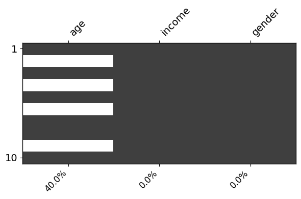
White = missing value
Black = observed value
Column-wise missing rates are annotated
Value-Colored Missingness Matrix
[4]:
plot_missing_matrix(df, sort_by = "income")
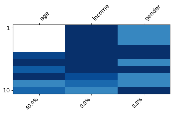
This version colors by the magnitude of values, helping to identify patterns between missingness and feature values.
Time Series Missingness Visualization
We now create a time-indexed dataset with artificial missingness.
[5]:
# Create normal values
values = np.random.normal(loc=50, scale=10, size=(20, 10))

# Apply missingness via MissMechaGenerator
mecha = MissMechaGenerator()
X_missing = mecha.fit_transform(values)

df_ts = pd.DataFrame(X_missing, index=pd.date_range('1/1/2011', periods=20, freq='D').strftime('%Y-%m-%d'))

df_ts.head()
[5]:
| 0 | 1 | 2 | 3 | 4 | 5 | 6 | 7 | 8 | 9 | |
|---|---|---|---|---|---|---|---|---|---|---|
| 2011-01-01 | 54.967142 | 48.617357 | NaN | 65.230299 | 47.658466 | 47.658630 | 65.792128 | 57.674347 | 45.305256 | NaN |
| 2011-01-02 | 45.365823 | 45.342702 | 52.419623 | 30.867198 | 32.750822 | 44.377125 | NaN | 53.142473 | 40.919759 | 35.876963 |
| 2011-01-03 | 64.656488 | 47.742237 | 50.675282 | 35.752518 | 44.556173 | 51.109226 | 38.490064 | 53.756980 | NaN | 47.083063 |
| 2011-01-04 | 43.982934 | NaN | 49.865028 | 39.422891 | 58.225449 | 37.791564 | NaN | 30.403299 | 36.718140 | NaN |
| 2011-01-05 | 57.384666 | 51.713683 | 48.843517 | 46.988963 | 35.214780 | 42.801558 | 45.393612 | 60.571222 | NaN | 32.369598 |
Time Series Matrix Plot
[6]:
plot_missing_matrix(df_ts,ts = True,figsize=(10, 8))
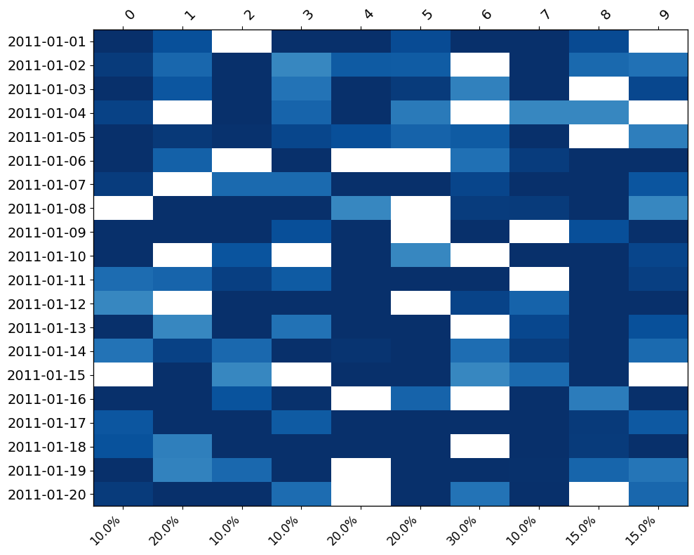
Here only the first and last row indices are shown, designed for cleaner time series views.
Nullity Correlation Heatmap
Create Mixed Dataset
[7]:
data_mixed = pd.DataFrame({
    "DATE": ["09/10/2016", "03/31/2016", "03/16/2016", "04/01/2016", np.nan, "04/03/2016"],
    "TIME": ["12:09:00", "22:10:00", "14:58:00", np.nan, "08:30:00", "19:00:00"],
    "BOROUGH": ["QUEENS", "BROOKLYN", "MANHATTAN", "QUEENS", "BRONX", np.nan],
    "ZIP CODE": ["11427", "11223", "10001", "11434", np.nan, "10010"],
    "LATITUDE": [40.724692, 40.598761, 40.712776, np.nan, 40.850000, 40.755000],
    "LONGITUDE": [-73.874245, -73.987843, -74.006058, -73.900000, -73.880000, np.nan],
    "VEHICLE TYPE": ["BICYCLE", "PASSENGER VEHICLE", "TAXI", "SUV", np.nan, "BICYCLE"]
})

data_mixed.head()
[7]:
| DATE | TIME | BOROUGH | ZIP CODE | LATITUDE | LONGITUDE | VEHICLE TYPE | |
|---|---|---|---|---|---|---|---|
| 0 | 09/10/2016 | 12:09:00 | QUEENS | 11427 | 40.724692 | -73.874245 | BICYCLE |
| 1 | 03/31/2016 | 22:10:00 | BROOKLYN | 11223 | 40.598761 | -73.987843 | PASSENGER VEHICLE |
| 2 | 03/16/2016 | 14:58:00 | MANHATTAN | 10001 | 40.712776 | -74.006058 | TAXI |
| 3 | 04/01/2016 | NaN | QUEENS | 11434 | NaN | -73.900000 | SUV |
| 4 | NaN | 08:30:00 | BRONX | NaN | 40.850000 | -73.880000 | NaN |
Nullity Correlation Heatmap
[8]:
plot_missing_heatmap(data_mixed, method = "kendall", figsize=(10, 6))
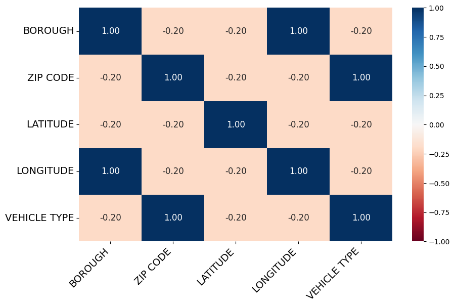
This shows pairwise relationships between missingness patterns:
Positive correlation: variables tend to be missing together
Negative correlation: missingness in one variable implies observed values in another
Key Takeaways
plot_missing_matrix()visualizes missingness across datasets, in both binary and color-encoded modes.plot_missing_heatmap()reveals structural missingness dependencies.MissMecha visualization tools help diagnose missingness mechanisms at a glance.